Blog
Customer Service Key Performance Indicators: A 2026 Guide
By
Nelson Uzenabor

Most advice on customer service key performance indicators is backwards. It tells teams to collect more metrics, tighten response targets, and celebrate greener dashboards. Then support leaders wonder why customers still leave, agents still burn out, and automation still creates more cleanup than relief.
The problem isn't that KPIs are useless. The problem is that many teams measure activity instead of outcomes. A low Average Handle Time can mean your team is efficient. It can also mean agents are hurrying people off the line. A high bot containment rate can look like automation is working. It can also mean customers are trapped in loops and reopening the same issue later.
I've seen the same pattern across human-led support teams and AI-assisted workflows. When leaders focus too narrowly on speed, they often damage the two things that matter more: whether the issue was solved, and whether the customer would trust the company again. That's why a dashboard full of green can still hide a failing support operation.
A better approach is to organize customer service key performance indicators around three questions:
Efficiency: Are we using time and team capacity well?
Quality: Are we resolving issues correctly and with low effort?
Loyalty: Is support strengthening the customer relationship?
That framing matters even more in automated environments. AI changes the unit of analysis. You're not only measuring how agents perform. You're measuring whether the system as a whole prevents repeat work, reduces effort, and preserves trust. If you're rethinking your broader customer support strategy, your KPI model should change with it.
Table of Contents
The Three Pillars of Modern Customer Service KPIs
A lot of KPI dashboards reward the wrong wins. They make automation look successful because tickets close faster, while customers come back with the same issue, escalate to a human, or leave frustrated. A modern scorecard has to separate true efficiency from fake efficiency.

I group customer service KPIs into three pillars: efficiency, quality, and loyalty. That mix matters even more once AI handles part of the workload. If you only track speed, bots can inflate performance by deflecting easy conversations and dumping hard ones onto agents. If you only track satisfaction, you can miss rising cost per resolution. If you only track loyalty, you will know the outcome late, after the operational problem has already spread.
Efficiency
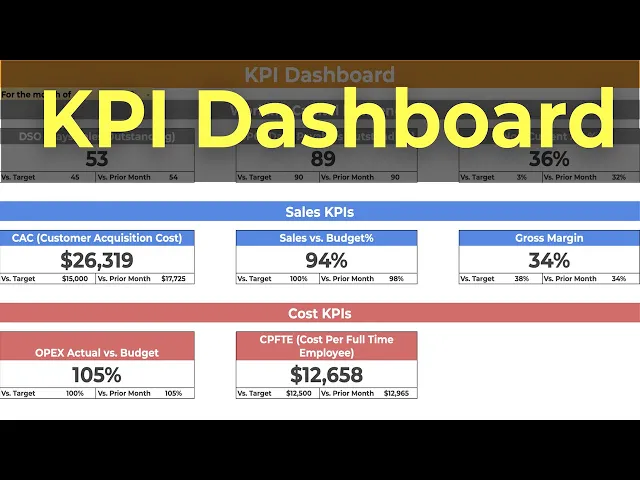
Efficiency KPIs measure how much time, labor, and workflow overhead it takes to deliver support. Common examples include Average Handle Time (AHT), first response time, and backlog growth. AHT is calculated as (Total Talk Time + Total Hold Time + Total Follow-up Work Time) / Total Number of Interactions.
AHT still matters. I use it to spot friction in tooling, routing, and agent workflow. I do not use it as a standalone target, because low AHT can mean two very different things: a clean resolution or a rushed interaction that creates a repeat contact.
That distinction gets sharper with automation. An AI assistant can reduce handle time and still increase total effort if customers need a second conversation to fix what the first one missed. Teams that want a more honest read should pair AHT with recontact rate, escalation rate, and chatbot analytics that show containment and handoff quality.
Quality
Quality KPIs answer the question that speed cannot answer. Did the customer get the right answer with as little friction as possible?
The two metrics that usually deserve the most attention here are First Contact Resolution (FCR) and Customer Effort Score (CES). FCR is calculated as (Tickets Resolved on First Contact / Total Tickets Submitted) × 100. Strong FCR usually correlates with better satisfaction because customers value not having to repeat themselves, reopen the issue, or switch channels to finish the job.
Practical rule: If a metric rewards closure faster than it rewards resolution quality, it will create repeat work.
CES belongs in this pillar for the same reason. A support flow can produce a technically correct answer and still feel difficult. Customers remember the friction. In practice, high-effort experiences show up later as follow-ups, complaints, refund requests, and lower trust in self-service.
This is also where older KPI models start to break. In an AI-supported operation, raw resolution rate is not enough. Track AI Resolution Rate only if you also track whether those resolutions passed QA or led to repeat contact. Better yet, use a Quality-Adjusted Resolution Rate so the dashboard credits automation for correct, durable resolutions rather than fast exits.
Loyalty
Loyalty KPIs look past the single interaction and ask whether support is strengthening the customer relationship. The best-known metric here is Net Promoter Score (NPS), calculated as % Promoters minus % Detractors on a scale from -100 to +100.
NPS is useful at the executive level because it reflects the accumulated customer experience, not just one support conversation. It is less useful as a daily operating metric for frontline teams. Support leaders should treat it as a lagging indicator. If NPS drops, underlying causes usually show up first in quality and effort metrics.
That is why these three pillars work together. Efficiency shows cost and throughput. Quality shows whether the issue was solved. Loyalty shows whether support is building trust or eroding it. In AI-augmented service, that balance keeps the dashboard honest.
Essential KPIs Explained Formulas Benchmarks and Insights
The best KPI set depends on your business model, ticket mix, and service promise. An e-commerce team handling delivery questions shouldn't copy the same scorecard as a SaaS team resolving product configuration issues. An agency supporting multiple clients needs a different view again. That said, a few metrics consistently earn their place.
What each core KPI actually measures
The table below covers the core customer service key performance indicators that teams commonly need to understand before adding anything custom.
KPI | Formula | Good Benchmark |
|---|---|---|
NPS | % Promoters - % Detractors | Above +50 |
FCR | (Tickets Resolved on First Contact / Total Tickets Submitted) × 100 | Above 75% is a critical operational threshold; best-in-class ranges reach 88-92% |
AHT | (Total Talk Time + Total Hold Time + Total Follow-up Work Time) / Total Number of Interactions | 4.5 to 6.5 minutes in mature contact centers |
CES | Survey question such as "How easy was it to resolve your issue?" on a 1 to 5 scale | Above 3.0 avoids the high-risk churn zone |
CSAT | Post-interaction satisfaction survey | Higher scores tend to follow strong FCR rather than fast closure alone |
NPS is a loyalty metric, not a support team productivity metric. It tells you whether the cumulative customer experience is creating advocates or detractors. That makes it useful for executive visibility, but less useful for diagnosing a broken workflow on its own.
FCR is one of the few metrics that cuts across customer experience and cost control. Verified data shows unresolved issues that require a second contact increase resolution costs by 40% to 60%. That's why FCR often tells you more than raw response speed.
AHT has value when used as a guardrail. It becomes dangerous when leaders optimize it without context. The "speed-accuracy paradox" is real. Teams can shorten the first interaction and still increase total system effort if customers have to come back.
CES is often underused. In practice, it's one of the cleanest ways to catch friction that doesn't show up in closure reports. If customers say resolution was hard, they usually mean your process, language, handoffs, or channel design forced them to do extra work.
High-performing teams don't ask, "How fast did we close it?" They ask, "Did the customer need to think about us again after this interaction?"
If you're already digging into conversational patterns, a good next step is reviewing chatbot analytics for support teams alongside these broader service KPIs.
A practical KPI starter pack by business model
Different support models need different scorecards. Start narrow and choose metrics that expose the main failure mode in your business.
For e-commerce, the main risk is volume-driven chaos. A useful starter pack is:
FCR: Because order, shipping, refund, and return contacts should often be resolved in one interaction.
CES: Because customers judge the experience by how easy it was to fix a problem.
AHT: As a secondary efficiency measure, not a target to force downward.
For SaaS, the main risk is solving the ticket but weakening retention. A stronger set is:
NPS: Because loyalty and advocacy matter beyond the support queue.
FCR: Because product confusion compounds quickly when users need multiple contacts.
CES: Because complex products can still feel easy to get help with, or painfully difficult.
For agencies and service firms, the main risk is hidden inconsistency across accounts. Focus on:
FCR: To catch weak handoffs and poor intake.
CES: To spot clients whose end users are struggling through the process.
NPS: To understand whether service quality is protecting long-term relationships.
The wrong way to choose KPIs is to mirror another company's dashboard. The right way is to identify what failure looks like in your operation, then track the few measures most likely to reveal it early.
The New Frontier Measuring AI and Automation Success
Most support dashboards still assume humans do the meaningful work and automation sits on the edges. That's outdated. Once AI handles frontline conversations, categorizes intent, and escalates selectively, old scorecards stop reflecting what the support system is really doing.

Why traditional dashboards break in automated support
Traditional KPIs overweight human output. They ask how many tickets agents handled, how quickly they replied, and how long they stayed in queue. Useful, but incomplete.
The more important question in an AI environment is whether automation prevented human work without harming the customer experience. Verified Gartner data says 60% of enterprises plan to deploy AI for customer service, yet only 35% have defined KPIs to measure AI-specific success, according to this overview of AI KPI gaps in customer service. That's why many SMBs can't tell whether their automation investment is helping or instead shifting work around.
A second problem is false success. A bot can close a conversation quickly and still fail the customer. Verified McKinsey data says 45% of companies experience a reduction in customer satisfaction after automating support because they optimized for speed metrics over quality, as noted in the brief. That isn't an automation problem by itself. It's a measurement problem.
The AI metrics that deserve a permanent place on your dashboard
Start with AI Resolution Rate. This is the percentage of total tickets fully resolved by AI without human escalation. It answers the question most dashboards ignore: how much work did the AI remove from the human queue?
Then track Ticket Deflection Rate. This shows how many inquiries never needed an agent because automation handled them through chat, self-service, or guided flows. Deflection matters because support economics improve when the system prevents work, not just when agents process it faster.
The most important modern metric, in my view, is Quality-Adjusted Resolution Rate. It treats resolution as valid only if the issue stays resolved. If a ticket closes and then reopens, or if a customer escalates right after an AI interaction, that should reduce the score. Without this adjustment, teams celebrate false wins.
A bot that closes tickets isn't necessarily helping. A bot that resolves issues and prevents repeat contact is helping.
The old question was, "How productive are our agents?" The better question now is, "How reliable is our support system?" If automation lowers queue load but raises reopens, effort, or frustration, the dashboard has to surface that contradiction.
For teams building a modern support stack, automated customer service workflows should be evaluated with AI-specific KPIs from day one, not added as an afterthought.
How to Track KPIs with a Chatgrow Dashboard
A dashboard should help a support lead make a decision in minutes. If it takes a meeting to explain what changed, the dashboard is reporting history, not helping the team run the operation.
Build a dashboard that shows cause and effect
The best dashboard layout follows the decisions your team makes.
Start with a service health panel. Put FCR, CSAT, reopen rate, and time-to-resolution in one view. A rise in FCR looks good until reopens climb with it. A drop in handle time looks efficient until CSAT comments mention customers having to repeat themselves. Putting these metrics together exposes false wins fast, especially after workflow changes or new automation launches.
Then create an automation reliability panel. Track AI Resolution Rate beside escalation rate, fallback rate, and unresolved intents by topic. This is the panel I check first after any bot update. High containment is meaningless if the same intent keeps reaching agents with more frustration attached. The goal is not maximum bot volume. The goal is fewer customer problems reaching humans, without creating avoidable repeat contact.
A third panel should cover customer friction signals. Pull in low-CES comments, repeated complaint themes, and the questions customers ask right after an AI interaction. That combination helps teams find where automation sounds helpful but fails at the last step, such as policy exceptions, account-specific issues, or weak handoff logic.
Turn reporting into an operating rhythm
Dashboards work when they trigger action, not observation.
Set alerts for changes that deserve investigation:
FCR drops sharply: Review recent routing changes, agent handoffs, and knowledge gaps.
Reopen rate rises after AI resolution: Audit those conversations for incorrect answers, premature closures, or weak escalation rules.
CES comments worsen: Check whether the workflow added steps, unclear wording, or forced customers into self-service that did not fit the issue.
One intent keeps falling back: Fix the content, training examples, or escalation path before the failure spreads across more conversations.
Run a weekly KPI review with one rule. Every metric on the screen must lead to an owner and a next step. Look at the top unanswered intents, tickets marked resolved that came back, and AI conversations that ended without resolution but did not escalate correctly. That review usually surfaces the same operational problems over and over: stale help content, bad routing, overconfident bot replies, and policies that require a person even though the flow pretends otherwise.
A short walkthrough helps make that process concrete:
Ownership matters just as much as visibility. Give each KPI to someone who can change the system behind it. FCR might sit with support operations. AI Resolution Rate might sit with the automation lead. Reopen rate often needs shared ownership between content, QA, and frontline management. Without that structure, dashboards become status screens, and status screens rarely fix anything.
Common KPI Pitfalls and How to Avoid Them
Most KPI mistakes aren't technical. They're incentive mistakes. Leaders choose a metric, teams adapt to the target, and the customer absorbs the side effects.

The most common traps
Vanity metrics: Teams celebrate high closure volume or heavy bot usage without checking whether problems stay solved. The antidote is to pair volume with reopens, escalations, or effort signals.
Lack of context: AHT falls, but customers are working harder. FCR rises, but tickets reopen later. Metrics need companions. Speed should sit next to quality, not apart from it.
Too many KPIs: When every metric is "critical," nothing gets managed well. Pick a compact scorecard tied to actual decisions.
Ignoring qualitative evidence: Survey comments, repeated objections, and agent notes often reveal the failure mode faster than a chart can.
If a KPI can be improved by making the experience worse, it needs a balancing metric.
This matters even more in automation. Verified McKinsey data found that 45% of companies saw customer satisfaction decline after automating support because they optimized speed metrics over quality, highlighted in this McKinsey AI adoption summary. That's the clearest example of a false win. Fast isn't better when customers come back angrier.
Conclusion Building a Smarter Support System
Good support measurement doesn't start with a list of acronyms. It starts with judgment. You need enough metrics to see the truth, not so many that the team chases noise.
The most durable scorecards balance efficiency, quality, and loyalty. They treat AHT as a guardrail, not a mission. They give FCR and effort more weight than raw closure speed. They look beyond the ticket and ask whether support is building trust. That's especially important because verified CES data shows that a CES score below 3.0 predicts a 25% higher probability of customer attrition within 12 months, according to this CES and churn reference.
AI raises the bar. Once automation enters the workflow, traditional human-only dashboards stop being enough. Teams need AI Resolution Rate, deflection, and quality-adjusted measures that expose false wins before customers do.
If your metrics lead to better decisions, support stops acting like a cost center. It becomes a system that protects revenue, reduces waste, and earns loyalty.
If you want a practical way to put these ideas into action, Chatgrow helps teams deploy AI support agents, monitor performance, and improve outcomes without losing sight of resolution quality. It's a useful option for businesses that want faster support and better measurement at the same time.
Related Posts
Continue Reading
More articles from the ChatGrow Team.